Creating My Life in Weeks
- tabithaadiaz
- Sep 7, 2025
- 2 min read
As part of a graduate school assignment at MICA, we were asked to create a visualization that showcased how we had arrived at this point. I decided that I wanted to explore this from birth up until now.
I decided to draw inspiration from Sara K Miller's 10,000 Days of Life. However, for my visualization, I decided to provide this story at the weekly level. Now that I had the concept, it was time to get started.
The Data
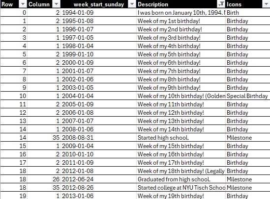
This was the part of the visualization that took some time to sort out. Since I was basing this on key events in my life, I needed to create a custom data set.
What would a data set like this look like?
Step 1
I knew I needed 2 columns to define each of the data points. One column had to be my row points and the other needed to be my column points. This means that for every year, I would need a corresponding row/column number. In this case, that means 52 column points (since I was displaying the data at the weekly level), with 0 along the rows to represent the year I was born.

I completed my dataset and had 31*52 rows (representing 31 years) and each of those rows had a number from 1-52 to represent the 52 weeks in a given year.
Step 2
Now that I had the bones to my data set, I needed to find a way to get the week start date since 1994. This is where I leveraged ChatGPT to give me the dates (Sunday start) from 1994-2025. After a few seconds, it created an Excel file with all of the week start dates. From that Excel, it was just a copy and paste into my current Excel. There were now three columns in my data set.

Step 3
The last part was the fun part! I included two more columns. One column was for descriptions of milestones within a given week and the other column was for icons. Here, I used my calendar, LinkedIn, and emails to pinpoint when certain events happened.
The End Result
After all of the data prep, I was finally ready to visualize the data in Tableau. Each point represents a week within a year. For the points that had a milestone, I made those larger and included a flower icon. When you hover over those icons, you can read about the milestone, good and bad.

You can explore the visualization further here.


Comments